The daisy wheel brand mark

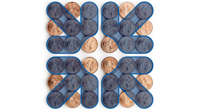
Image: an illustration showing how the daisy wheel symbol was devised from piles of coins © RBS 2018
The 'daisy wheel' symbol has been central to The Royal Bank of Scotland's brand since 1969.
Before branding
Before the mid-20th century, most banks felt little need to differentiate their identities from those of their rivals. Although some businesses began using trademarks to distinguish and promote their products towards the end of 19th century, banks did not develop such identities until much later.
Until the 1940s and 1950s, bank branches were often identified by no more than a sign saying 'Bank' or the bank's name in simple lettering. Stationery and advertisements did not feature any particular symbol or style. For the banks, it was more important to convey a message of solidity and stability (for example, through a handsome, stone-built branch in a prestigious location) than to create a unique identity.
Defining an identity
In the years after the Second World War, growing competition and the emergence of a handful of large high street banks with nationwide reach led banks to think more seriously about defining and differentiating their public identities. In 1960 The Royal Bank of Scotland adopted a coat of arms for the first time.
The arms incorporated various symbols representing the bank's past and present, including representations of Scottish identity, royal connections and the importance of foreign and domestic trade. The coat of arms soon became a prominent feature on the bank's buildings, uniforms, stationery and banknotes.
Devising the daisy wheel
In 1969 The Royal Bank of Scotland merged with National Commercial Bank of Scotland. The merged bank retained the Royal Bank name, but a new corporate structure was also created, whereby a holding company - National & Commercial Banking Group (later to become RBS Group) - was created to own both the Royal Bank and its English and Welsh subsidiaries.
These changes in the bank itself coincided with increasing use of marketing and advertising in all areas of British life. The need for a clear, unique branding emblem was becoming stronger than ever. Meanwhile, the Royal Bank's coat of arms was losing favour, as research revealed that many people could not easily distinguish between different coats of arms.
The bank briefed its designers to devise a symbol that would be striking and recognisable in a range of contexts, sizes and materials. It was to be used by the Royal Bank itself as well as by the group holding company and (from its formation in 1970) its English and Welsh subsidiary, Williams & Glyn's Bank.
The designers took a pile of coins as their starting-point and found that the coins could be arranged into the shape of four arrows pointing inwards. The design represented, in abstract form, the accumulation and concentration of wealth in customers' interests. It was used in dark blue in contexts where it represented the Royal Bank of Scotland, and in mid-blue for National & Commercial Banking Group. From 1985 onwards - by which time the group's name had become The Royal Bank of Scotland Group - dark blue was used in both contexts.
Making a mark
During the early 1970s, brand marketing became a vital tool. The RBS daisy wheel began to appear in a wide range of contexts, including buildings, stationery, banknotes, plastic cards and uniforms. It was not long before it began to appear on promotional items too.
As corporate marketing became more sophisticated and competitive in the 1980s and 1990s, promotional gifts became popular, and almost always featured branding. These items ranged from badges, pens and keyrings to jigsaws, towels and rugby shirts.
In more recent years the symbol has remained an important part of the bank's corporate identity, making the transition into the many digital formats where the bank is now present, including websites, digital banking and social media.
